

The partnership between early naturalists and visual artists established the foundation for modern botanical art and scientific accuracy, transforming plant depiction from decorative marginalia into a rigorous investigative tool. In the sixteenth century, physicians and apothecaries required reliable images to distinguish therapeutic species from toxic lookalikes, so they began directing draftsmen to emphasize diagnostic structures such as flower morphology, fruit type, and root habit rather than aesthetic arrangement. This shift demanded a new visual vocabulary where magnification, cross section, and habit sketches replaced symbolic representation. By the time Linnaeus formalized binomial nomenclature in the mid eighteenth century, illustrators were already producing plates that functioned as type specimens in their own right, allowing taxonomists to compare material across continents without living plants. Understanding this historical trajectory equips contemporary practitioners to make deliberate choices about media, scale, and annotation that honor the discipline’s dual allegiance to beauty and data.
Assess the Research Questions That Drive Visual Priorities
Before touching pencil to paper, the illustrator must clarify which biological questions the image will answer, because each query dictates a different hierarchy of detail. A floristic treatment for a regional flora may require only habit, leaf venation, and inflorescence type rendered at life size, while a monograph on a taxonomically complex genus could demand micrometer scale dissections of stamens, pollen exine patterns, and seed coat sculpture. Early botanists such as Tournefort and the Jussieu family annotated their sketches with marginal notes describing ovary position and placentation, effectively embedding the research agenda into the artwork itself. Modern practitioners should adopt a similar habit by drafting a written brief that lists every structure the taxonomist or ecologist expects to see, then ranking those structures by diagnostic weight. This brief becomes a checklist that prevents the common error of lavishing hours on showy petals while neglecting the inconspicuous bracts that actually separate two sister species.
Once the brief is set, gather voucher specimens, herbarium sheets, and live material under permits, and photograph each target structure with a scale bar and color standard. Early microscopists like Robert Hooke and later Franz Bauer calibrated their camera lucida drawings against stage micrometers, a practice that remains the gold standard for reproducibility. Digitally, a focus stacked series captured at known magnification allows later measurement of any feature without reexamining the specimen. Organize these reference files in a folder named with the taxon, collector number, and date so that future revisions or peer review can trace every line back to physical evidence. Skipping this documentation step is the single most frequent cause of irreversible errors that surface only after publication.
Select Media and Magnification Aligned to Structural Complexity
Choosing the right medium is not an aesthetic preference but a technical decision driven by the smallest feature that must be resolved. Pen and ink on drafting film remains the workhorse for line work because it reproduces cleanly at high magnification and tolerates reduction to quarter size without loss of stipple integrity. Watercolor on hot press paper excels at conveying surface texture such as pubescence or glaucous bloom, yet it fails when the subject requires consistent line weight across a plate that mixes habit drawings at one centimeter scale with floral diagrams at ten times magnification. Early adopters of copperplate engraving solved this by engraving separate plates for each scale, a workflow mirrored today by scanning inked layers at six hundred dots per inch and compositing them in raster software. If the project includes scanning electron micrographs of pollen, plan a workflow that integrates those grayscale images as separate panels rather than attempting to translate them into hand drawn tone.
Test your chosen combination of pen nib, ink, and substrate by drawing a standardized test grid of lines, dots, and cross hatches at the intended reproduction size, then print a proof on the target paper stock. Many illustrators discover too late that a favorite crow quill nib feathers on a particular film, or that a watercolor wash bleeds into adjacent ink lines when the plate is wet mounted. Historical workshops maintained sample books of every nib and paper batch; a modern equivalent is a small swatch card kept in the project folder. Record the exact nib number, ink batch, and paper lot so that corrections made months later match the original stroke character. This discipline eliminates the visual dissonance that betrays a composite plate assembled from mismatched sessions.
Construct the Plate Layout Using Taxonomic Logic
The arrangement of figures on a plate should mirror the logical flow of a taxonomic description, guiding the viewer from whole plant context to diagnostic details in the same sequence a key would present them. Start with a habit sketch at the top left showing overall architecture, root system if relevant, and scale bar. Proceed clockwise with a leaf detail showing venation and margin, then an inflorescence diagram, followed by dissected flower parts numbered to correspond with a caption key. Early botanical atlases such as the Flora Danica standardized this reading order so that botanists could compare plates across volumes without relearning each layout. Deviating from this convention forces the reader to hunt for structures, increasing cognitive load and the risk of misidentification.
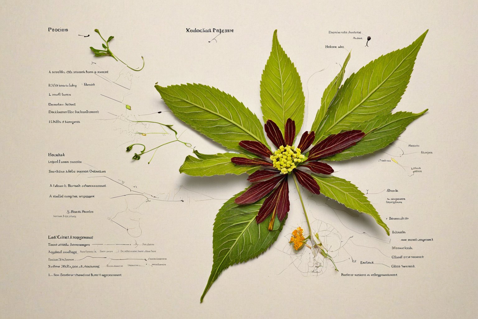
Leave generous white space around each figure to accommodate future labels, and align all scale bars to a common baseline so they can be compared at a glance. When a genus requires multiple species on one plate, group them by taxonomic section and use consistent viewing angles, for example all flowers in lateral view with the adaxial side facing right. The Bauers and Ferdinand Bauer in particular pioneered a color code system where each hue represented a specific tissue type across dozens of plates, allowing instant visual parsing. Adopt a similar coding scheme for your own work, documenting it in the plate legend. Avoid the temptation to fill empty corners with decorative elements; every millimeter of the plate should serve the research brief established in step one.
Execute Diagnostic Details With Measured Precision
Rendering begins with the structures that carry the highest taxonomic weight, typically reproductive organs, because errors here propagate into misidentifications that persist in literature for decades. Use a camera lucida or digital drawing tablet calibrated to the microscope stage to trace outlines directly from the specimen, then add stipple and hatching to convey surface relief. Ancient astronomers relied on star maps to inspire artistic innovations, much like early microscopists studied celestial patterns for guidance. If a feature such as a nectary groove is visible only in cleared material, note the preparation method so the observation can be verified. Never invent texture to fill a gap; an honest blank with a note “obscured by debris” is scientifically preferable to a plausible but fictitious pattern.
To achieve depth in compositions, artists must apply principles of light science, ensuring each layer—line, tone, and color—is refined independently. A common mistake is to burnish watercolor over ink before the ink is fully waterproof, causing feathering that cannot be corrected digitally. Test ink permanence on a scrap of the same film with a wet brush before committing to the final sheet. For complex structures such as compound umbels or spikelets, draw each component separately, scan at high resolution, and assemble the composite in software where duplication and rotation maintain perfect geometric consistency. This modular approach echoes the way eighteenth century engravers reused copperplate vignettes across plates, saving labor while guaranteeing that identical structures look identical. Save every intermediate file with version numbers; the ability to roll back a single stamen without redrawing the entire flower saves hours during peer review revisions.
Integrate Color Standards and Reproduction Notes
Color fidelity remains the most vulnerable link between original artwork and printed plate, so embed a physical color standard such as a Pantone swatch or a printed Munsell chip alongside the specimen during photography and scanning. Early hand colored engravings relied on a master pattern colored by the author, which colorists copied under natural light; today the equivalent is a calibrated monitor profile and a soft proof simulation of the target press. Include a small color bar on the plate margin showing the exact CMYK or spot values for each major hue used in the illustration, and specify the rendering intent in the metadata. If the journal prints in grayscale, provide a separate version where tonal values encode the same structural information that color conveyed, using line density rather than hue to distinguish tissues.
Document the intended reproduction dimensions in the file name and in a readme text file, for example “Genus_species_plate_120mm_wide_300dpi.tif”. Many journals now require vector line work for text and scale bars while accepting raster for tone; prepare two layer groups accordingly. Early botanical publishers such as Curtis’s Botanical Magazine specified plate size down to the millimeter because the hand press dictated exact registration; modern offset and digital presses are more forgiving but still benefit from files built to the final trim size with three millimeter bleed. Supplying print ready files eliminates the production department’s guesswork and prevents the all too common outcome where a delicate stipple field becomes a muddy blob after automatic downsampling.
Validate the Plate Against Living and Herbarium Material
Before delivering the final artwork, conduct a blind validation by asking a colleague unfamiliar with the project to identify the illustrated taxon using only your plate and a standard flora. This stress test reveals ambiguities that the illustrator, primed by weeks of study, no longer sees. Early taxonomists routinely circulated proof plates among correspondents for exactly this purpose; Linnaeus himself corrected several plates in Species Plantarum after receiving annotated proofs from field botanists. Record every correction request, the reason, and the resolution in a change log that travels with the project archive. If a structure was omitted because the specimen lacked it, note that absence explicitly in the caption rather than leaving the reader to wonder.
Archive the original sketches, specimen photographs, measurement spreadsheets, and layered digital files in a repository with a persistent identifier such as a DOI. Many institutions now require data deposition as a condition of publication, and future researchers may need to remeasure a feature from your raw images when new characters become phylogenetically informative. The Bauers’ original watercolors, preserved at the Natural History Museum Vienna, have been reexamined with multispectral imaging to reveal underdrawings that clarify taxonomic decisions made two centuries ago. Treat your working files with the same foresight; they are not disposable byproducts but part of the scientific record. A well organized archive turns a single illustration into a lasting resource that continues to inform botany long after the journal issue is shelved.

I have spent the past decade exploring the intersections of Freemasonry, art, and science, researching historic manuscripts and architectural symbolism. My work as a freelance writer and independent researcher allows me to share the rich history of knowledge that these traditions embody.