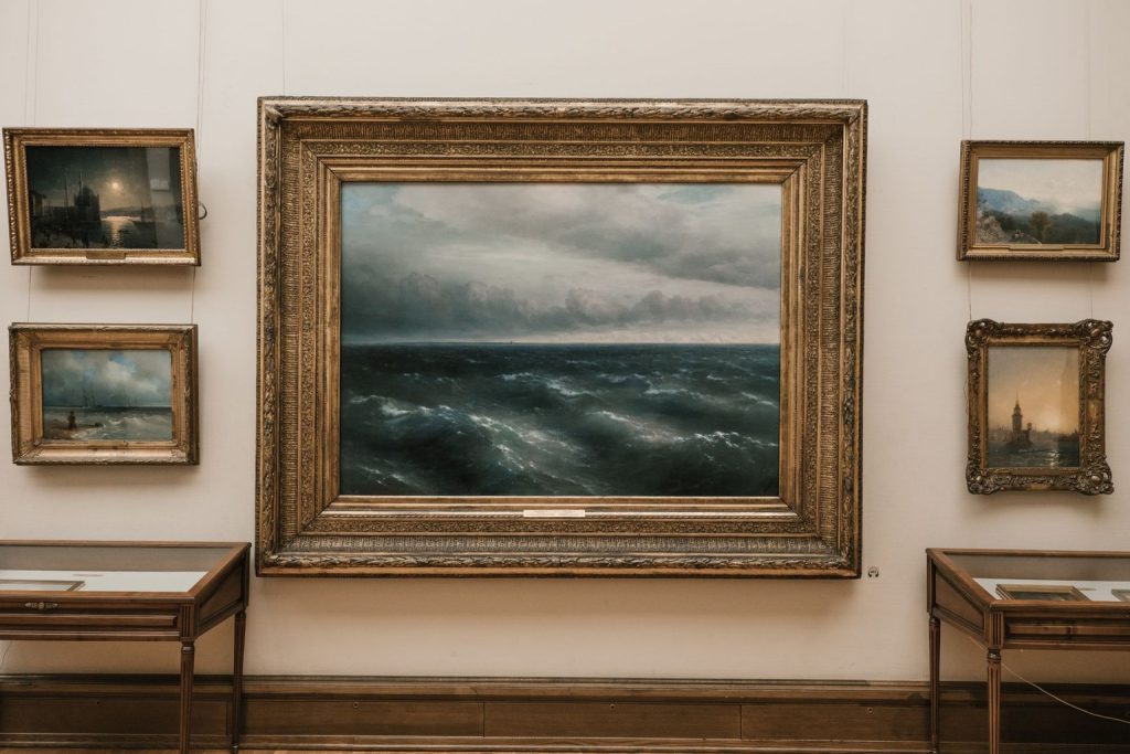
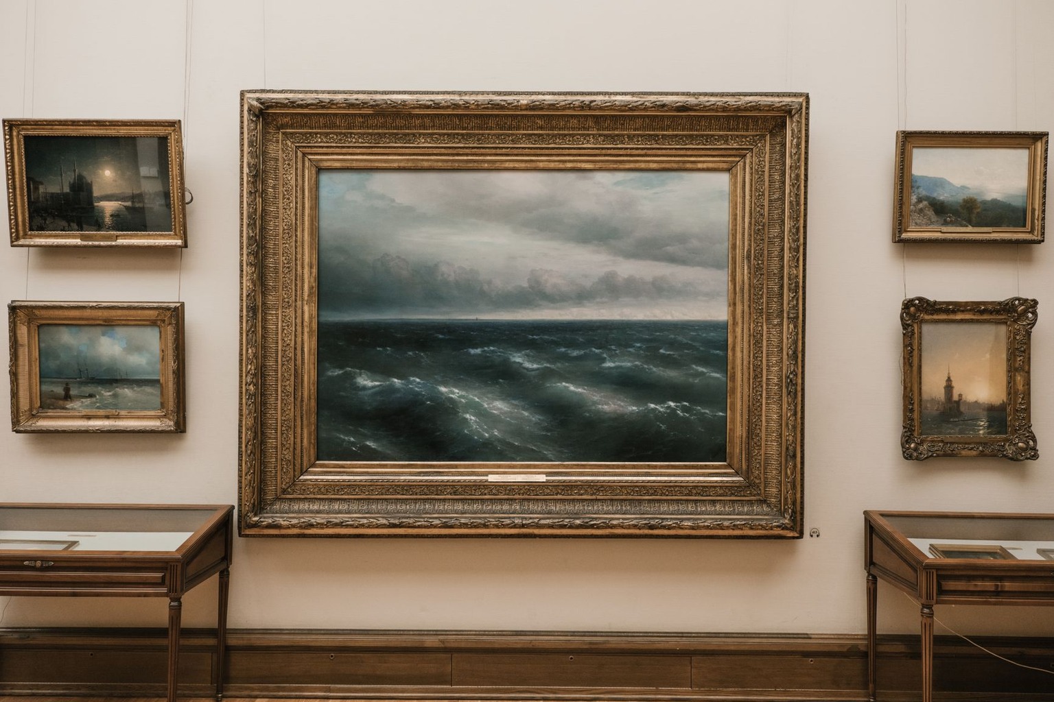
Painters from Vermeer to Caravaggio understood that a canvas does not create an image; it only suggests one until the room supplies the missing variable: illumination. The physical properties of the light source determine how much color saturation survives the journey to your retina, and that invisible mechanism dictates whether a masterpiece feels vibrant or flat. When a museum curator adjusts a spotlight from 500 lux to 150 lux, they are not merely protecting pigment; they are actively rewriting the emotional narrative of the piece by suppressing high-frequency details. This article examines the optical physics behind those changes and why the same painting can trigger two completely different visual experiences depending on the angle of incidence.
Spectral Power Distribution and Color Fidelity
The color temperature of a bulb is only half the story; the spectral power distribution (SPD) determines which wavelengths actually reach the pigment. A standard incandescent source floods the canvas with long red and orange wavelengths, naturally boosting warm tones and muting cool blues that lack sufficient energy to stimulate cone cells effectively. In contrast, a high-quality daylight-balanced LED emits a broader, more even spectrum that allows the full range of the artist’s original palette to register accurately in the visual cortex. If the SPD has deep valleys in the green or violet regions, those colors will appear desaturated and lifeless regardless of how bright the overall beam is.
This spectral gap creates a specific problem for works containing delicate pigments like smalt or lapis lazuli, which rely on precise wavelength reflection to achieve their depth. When the light source lacks the necessary short-wavelength energy, the blue notes in a portrait recede into the background, flattening the three-dimensional illusion that the painter carefully constructed over months of layering. Curators now use spectroradiometers to map these gaps before installing displays, ensuring the chosen fixture fills in the missing wavelengths without introducing harsh ultraviolet radiation that degrades organic binders over time.
The Physics of Glare and Surface Texture
Glare is not just an uncomfortable flash; it is a specific optical failure where direct light reflects off a glossy varnish layer directly into the viewer’s eye, washing out the underlying image. The gloss level of a varnish, measured in units called gloss units (GU), dictates how directional that reflection becomes, with high-gloss finishes acting almost like mirrors for the light source above. When the angle of incidence matches the angle of reflection at a specific point on the canvas, the viewer experiences a sudden loss of contrast and detail precisely where they are looking. This is why museum designers use asymmetric lensing to cut off the direct reflection path while still illuminating the painting’s surface evenly.
The texture of the paint itself, known as impasto in thick areas, scatters light in a way that smooth, thin glazes do not, creating a micro-topography that changes with viewer position. A broad, soft light source reveals the physical relief of thick brushstrokes through subtle shadows, adding a tactile dimension that flat lighting erases entirely. However, if the light is too hard or directional, those same impasto peaks cast sharp, distracting shadows that fracture the composition and pull attention away from the subject matter. Balancing this requires a high Color Rendering Index (CRI) source positioned at a steep angle to minimize specular highlights while preserving the tactile reality of the paint’s surface.
Retinal Adaptation and Perceived Contrast
Your eyes do not see light as an absolute measurement; they interpret it relative to the surrounding environment through a process called simultaneous contrast. When you step from a dark hallway into a brightly lit gallery, your pupils constrict and your retinal cells adjust their sensitivity over a period of seconds, a physiological shift that changes how you perceive the first painting you encounter. If the ambient light in the room is too high, the dimmer details within the artwork disappear as your visual system prioritizes the brighter surroundings to maintain overall contrast sensitivity. This is why spotlights are often paired with controlled ambient lighting rather than absolute darkness, which would cause eye strain and reduce the viewer’s ability to discern subtle tonal gradations.
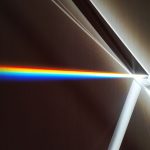
If you want to dive deeper into the physics of light, Professor Dave Explains covers color and refraction in this helpful video right here.

The concept of dynamic range becomes critical here, as the human eye can handle a ratio of about 10,000:1 between the brightest and darkest visible parts, but a digital camera or the average painted surface operates within much tighter limits. When illumination exceeds this biological threshold, the highlights in a painting clip into pure white, losing all texture and information, a phenomenon known as visual blooming in perceptual terms. Artists who worked with natural window light understood this limit intuitively, placing their brightest highlights where the sun would have been brightest to keep the entire composition within the comfortable range of human adaptation. Modern lighting design attempts to replicate this historical balance by carefully controlling the ratio between the key light and the fill light.
Directional Cues and Depth Perception
The direction from which light arrives is the primary cue your brain uses to reconstruct three-dimensional form from a two-dimensional surface, relying on consistent shadow placement to infer volume. If a painting depicts a face lit from the left, but the museum spotlight comes from the right, the shadows cast by the physical impasto will contradict the painted shadows, creating a visual dissonance that breaks the illusion of depth. This mismatch can cause the image to appear flat or even distorted, as the brain struggles to reconcile the conflicting spatial information coming from the paint and the environment. Consistency in lighting direction is therefore not an aesthetic preference but a functional necessity for preserving the integrity of the artist’s spatial logic.
Raking light, which strikes the surface at a very low angle, exaggerates these depth cues by stretching shadows and highlighting every brushstroke, a technique often used in conservation analysis to reveal hidden layers or cracks. While this is invaluable for technical examination, it is rarely suitable for general display because it overemphasizes texture at the expense of color and form, turning the painting into a topographic map rather than an image. The challenge for gallery designers is finding a middle ground where enough directional consistency exists to support depth perception without creating harsh, distracting shadows that interfere with the viewing experience.
Temporal Variability and Material Degradation
Light energy is cumulative damage, and the total dose received by a pigment over the life of an exhibition determines how quickly it fades, regardless of how beautiful the illumination looks on any given day. Organic dyes and certain inorganic pigments are photosensitive, meaning their molecular bonds break down when exposed to photons above a certain threshold energy, leading to irreversible color loss that no amount of careful display can reverse. This is why conservation standards often limit the annual exposure of sensitive materials to specific lux-hours, requiring curators to calculate the total light budget for each piece rather than simply setting a static brightness level.

The variability of natural daylight throughout the year presents a unique challenge for works displayed near windows or skylights, as the intensity and angle change constantly with the seasons and weather. A painting that looks perfectly balanced on a cloudy winter day may become overexposed and glaring on a bright summer afternoon, forcing viewers to squint or look away from the most important details. Some institutions now use dynamic lighting systems that adjust output in real time based on sensors monitoring ambient conditions, maintaining a consistent visual presentation while staying within strict conservation limits for the long term.
Psychological Impact of Color Temperature
The Kelvin rating of a light source influences not just color accuracy but also the emotional tone attributed to the artwork, with warm light evoking intimacy and cool light suggesting clarity or distance. A 2700K source creates a cozy, inviting atmosphere that suits intimate portraiture but can make landscapes look muddy and over-saturated, while a 5000K source provides a crisp, neutral backdrop that allows vibrant colors to pop without adding emotional bias. The choice between these temperatures is a curatorial decision that shapes the viewer’s psychological response before they even begin analyzing the content of the image. This subtle manipulation is a powerful tool for guiding interpretation and setting the mood for different types of artistic expression.
Research in environmental psychology suggests that mismatched color temperatures can cause cognitive dissonance, where the viewer feels uneasy or distracted without being able to articulate why the scene looks “wrong.” When the light source’s temperature contradicts the implied time of day or emotional context within the painting, the brain registers this inconsistency as a signal of inauthenticity or error. Aligning the lighting color temperature with the narrative intent of the work helps to immerse the viewer more fully, reducing cognitive load and allowing them to engage with the artistic message on a deeper level.

I have spent the past decade exploring the intersections of Freemasonry, art, and science, researching historic manuscripts and architectural symbolism. My work as a freelance writer and independent researcher allows me to share the rich history of knowledge that these traditions embody.