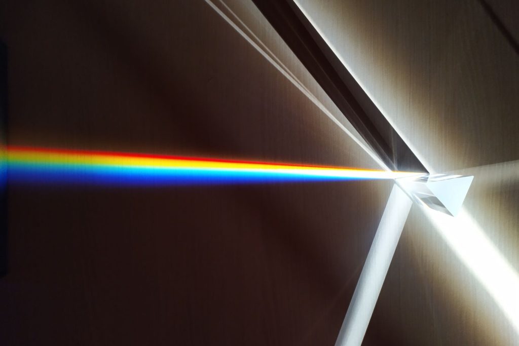
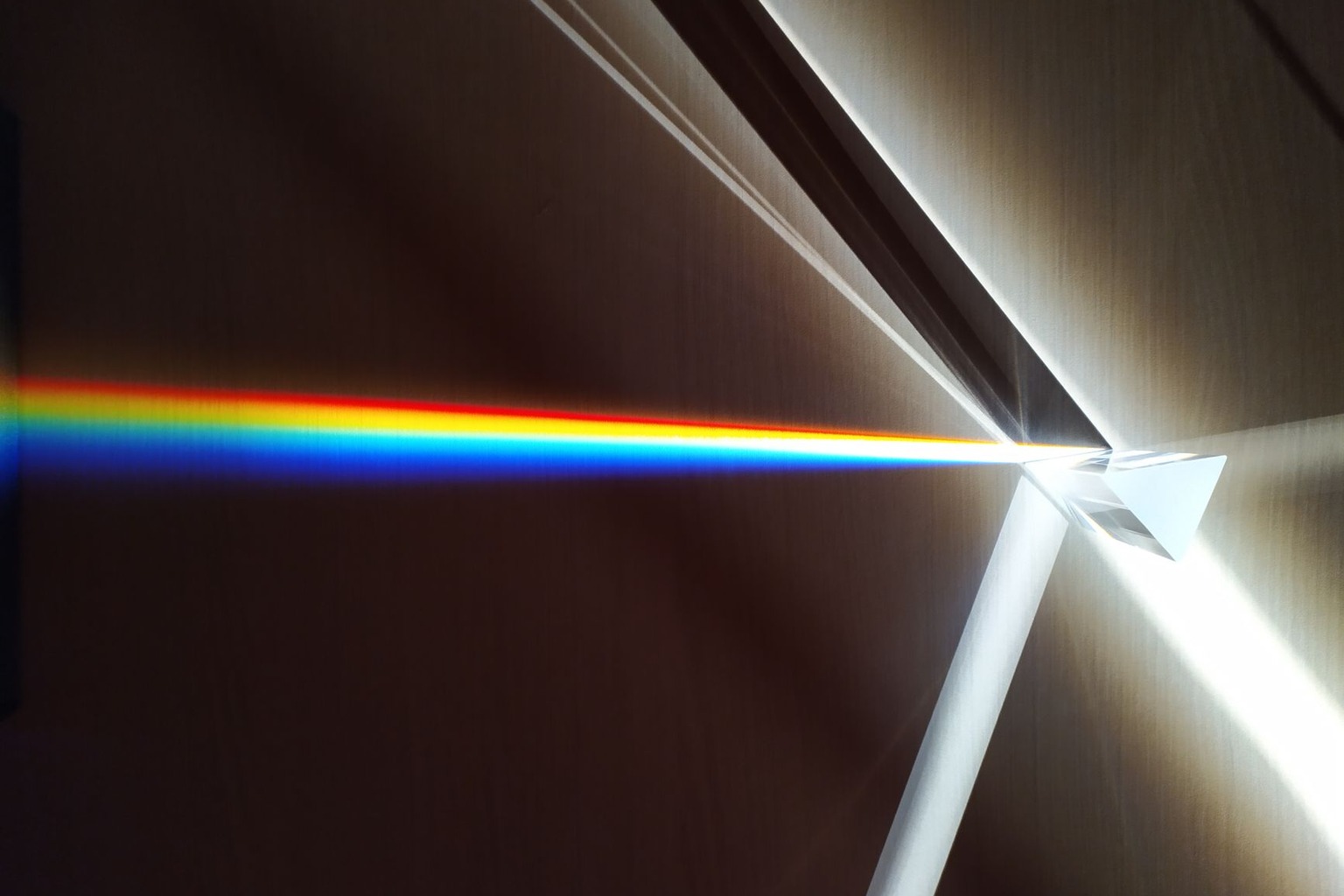
The interplay between optics and color perception in art is a hidden layer of creativity that reshapes how we interpret masterpieces. Long before pigments and brushstrokes dominated artistic discourse, the science of light, how it refracts, scatters, and interacts with surfaces, became the invisible architect of visual experience. This is not merely about the colors artists chose but about the physics that made those choices meaningful, the way light transforms a canvas from a flat surface into a living illusion. The forgotten science of light, once a cornerstone of artistic innovation, still lingers in the subtleties of how we see, yet its principles are rarely explored beyond technical manuals. Understanding this science reveals why certain paintings feel vibrant in daylight but fade in artificial light, why a single hue can evoke entirely different emotions under different conditions, and how artists like Vermeer or Turner exploited these phenomena to manipulate perception itself.
The Illusion of Depth: How Light Defines Three-Dimensionality on a Flat Surface
The most radical shift in how we perceive color came not from the pigments themselves but from the way light interacts with them. Before the 17th century, artists relied on limited techniques to suggest depth, layering glazes, using chiaroscuro, or relying on symbolic cues. But the introduction of perspective and the study of optics changed everything. Artists began to understand that light doesn’t just illuminate a surface; it creates an illusion of volume by casting shadows, reflecting highlights, and diffusing edges. This wasn’t just about making a painting look “real”, it was about training the eye to interpret two-dimensional marks as three-dimensional space. The Dutch Golden Age painters, for instance, used precise calculations of light falloff to make their interiors feel tangible, while Caravaggio’s dramatic contrasts exploited the way light hardens edges and softens others. Without this scientific grasp of optics, their work would have been flat, two-dimensional sketches rather than immersive scenes. The key insight was that color alone doesn’t carry depth; it’s the interplay of light and shadow that does.
This principle extends beyond realism. Even abstract artists like Wassily Kandinsky understood that light could structure form. His use of bold, contrasting hues wasn’t arbitrary, it was a deliberate manipulation of how the eye perceives movement and space. When Kandinsky placed a bright yellow next to a deep blue, he wasn’t just creating a color harmony; he was using the optical tension between wavelengths to suggest depth, rhythm, or even emotional distance. The science here isn’t about the pigments but about how the brain processes the way light bounces off surfaces and how artists exploit those processes to guide the viewer’s gaze. Without this understanding, abstract art would lack its signature dynamism, reducing it to static patterns rather than living compositions.
The Hidden Physics of Color Mixing: Why Artists Rejected Traditional Rules
The traditional color wheel, with its complementary pairs and primary hues, was a simplification that ignored the complexities of how light behaves. Artists like Johannes Itten, who taught at the Bauhaus, argued that mixing colors in paint wasn’t the same as mixing light. When pigments absorb certain wavelengths, they reflect others, creating a spectrum that’s fundamentally different from the additive mixing of light. Itten’s experiments showed that artists who mixed colors on a palette were working with subtractive processes, while the eye perceives colors additively, meaning the way a color appears on a canvas is always influenced by the light reflecting off adjacent hues. This discrepancy led to the development of optical mixing, where artists used rapid brushstrokes or dotting techniques to let the eye blend colors dynamically. Van Gogh’s swirling fields of light, for example, weren’t meant to be seen as static but as an illusion created by the viewer’s perception of movement and light interaction.
The implications for art are profound. If an artist follows the traditional color wheel strictly, their work may appear flat under certain lighting conditions. But by understanding the physics of light, they can create pieces that shift and evolve with the viewer’s perspective. This is why Impressionists like Monet often used broken color, small, distinct strokes that the eye merges into a single hue under the right conditions. The science here isn’t just about technique; it’s about defying the limitations of static representation. When light hits a canvas, it doesn’t just illuminate the pigments; it transforms them into a living, breathing experience that changes with the angle of view and the quality of illumination.
The Emotional Weight of Light: How Spectral Composition Shapes Mood
Color isn’t just a visual cue; it’s an emotional one, and the science of light explains why. Different wavelengths evoke different responses because they stimulate the brain’s limbic system in distinct ways. Warm tones (longer wavelengths) tend to feel inviting or energetic, while cool tones (shorter wavelengths) can evoke calm or melancholy. But the emotional impact isn’t just about the hue, it’s about how light interacts with the surrounding environment. A painting bathed in natural light will feel different from the same work under fluorescent lighting, not just because of color temperature but because the spectral composition shifts. For instance, sunlight contains a broader range of wavelengths, including ultraviolet, which can subtly alter how we perceive saturation and depth. Artists like Turner understood this intuitively; his seascapes often use a muted palette that seems to glow under sunlight but appears flat under artificial light, demonstrating how spectral composition can amplify or mute emotional resonance.
On the austin batchelor channel, they explain the science of light and color for artists, and you can watch it right here.
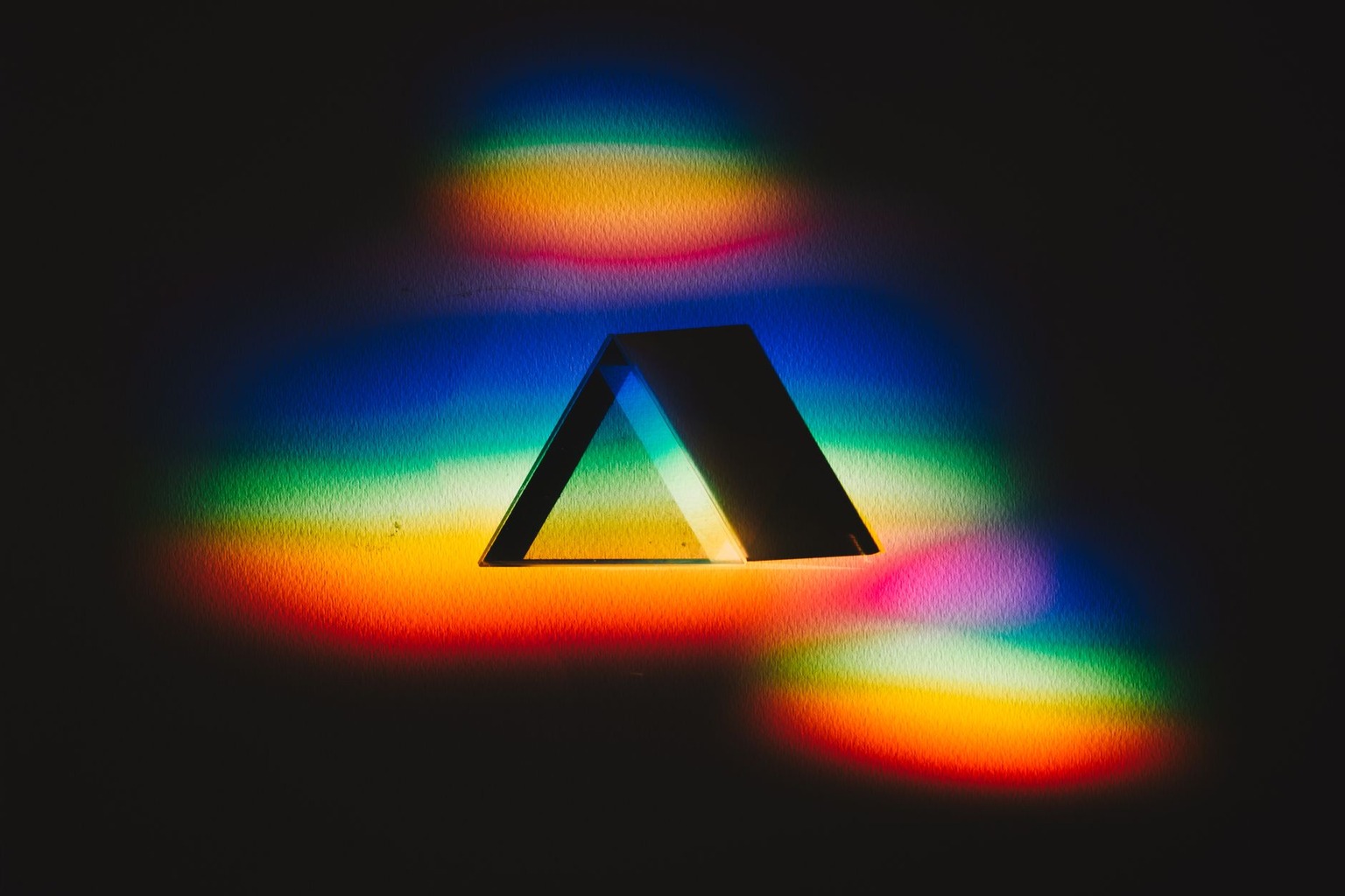
This is where the science of optics and color perception in art becomes particularly fascinating. The same hue can feel joyful in one context and somber in another, depending on the light source. A red painted under incandescent light might appear warm and inviting, while the same red under daylight could feel more intense or even aggressive. The emotional weight of a color isn’t inherent; it’s constructed by the interplay of light, pigment, and the viewer’s physiology. This is why galleries carefully control lighting, it’s not just about preserving the art but about preserving the intended emotional experience. The science here reveals that color isn’t passive; it’s a dynamic force shaped by the very conditions that bring it to life.
The Limits of Perception: Why Some Colors Disappear Under Certain Lights
Not all colors behave predictably under different lighting conditions, and this is where the science of optics reveals its most counterintuitive truths. Some hues, particularly those in the blue and green spectrums, can appear to vanish or shift dramatically when viewed under artificial light. This happens because artificial sources like LEDs or fluorescent bulbs emit light at specific wavelengths, which can mask or enhance certain colors in unpredictable ways. For example, a vibrant blue painted under daylight might look rich and deep, but under a cool-white LED, it could appear washed out or even take on a greenish tint. This phenomenon isn’t just a quirk of technology, it’s a direct consequence of how light interacts with pigments. When a pigment absorbs certain wavelengths, it reflects others, and if the light source lacks those reflected wavelengths, the color can appear muted or altered. Artists like Paul Cézanne, who worked extensively with complementary colors, were acutely aware of this; his landscapes often rely on subtle shifts in hue that only become visible under natural light.
The implications for preservation and display are critical. Many museums now use tunable white lighting, which adjusts the color temperature to match the original conditions under which a painting was created. Without this, a masterpiece could lose up to 30 percent of its perceived vibrancy in certain lighting conditions. The science here isn’t just about aesthetics, it’s about ensuring that the emotional and perceptual impact of a work remains intact. When light fails to support a color’s intended appearance, the art doesn’t just look different; it feels different, and sometimes even loses its intended meaning. This is why the study of optics isn’t just a technical curiosity, it’s a vital part of art’s survival.
The Alchemy of Light and Pigment: How Artists Mastered the Unseen
The most advanced artists of the past didn’t just paint, they conducted experiments in optics. Vermeer, for instance, used a technique called “dry brushing” to capture the way light scatters at edges, creating an effect that feels almost photographic. His ability to render a woman’s pearl earring as both reflective and matte was achieved by understanding how light interacts with different surfaces. Similarly, Rembrandt’s use of sfumato, blending colors without harsh lines, was a direct application of the principle that light softens transitions between hues. These techniques weren’t just stylistic choices; they were scientific observations translated into brushstrokes. The alchemy here lies in the fact that artists could manipulate perception by controlling how light interacts with their medium, turning a flat surface into a window into another world.

This mastery of the unseen extended to materials as well. Artists like Titian experimented with glazing techniques, where thin layers of transparent pigment allowed light to pass through and interact with the underlying layers, creating depth and luminosity. The result wasn’t just a richer color but a dynamic interplay of light and shadow that made the painting feel alive. Without this understanding of optics, these techniques would have been little more than gimmicks. The science of light wasn’t just a tool for artists, it was the foundation upon which their entire approach to color and form was built. Today, digital artists and color theorists still grapple with the same principles, proving that the forgotten science of light remains as relevant as ever.
The Future of Perception: How Light Redefines Art in the Digital Age
The digital revolution has brought new challenges and opportunities to the science of optics and color perception in art. Digital displays, with their backlit LEDs, don’t replicate the spectral composition of natural light, meaning that a color on screen can look entirely different when printed or viewed in person. This discrepancy has led to a resurgence of interest in traditional color theory, as artists and designers seek to bridge the gap between digital and physical perception. Programs like Adobe Lightroom now include spectral analysis tools that allow users to simulate how a color will appear under different lighting conditions, a feature that would have been unimaginable to 19th-century painters. Yet, the core principles remain the same: light shapes how we see, and artists must account for its nuances to create meaningful work.
The digital age has also introduced new mediums where light itself becomes the pigment. Projection mapping, for example, uses light to transform physical spaces into dynamic canvases, where color and form are entirely constructed by spectral interaction. Artists like Refik Anadol use machine learning to generate light-based installations that respond to real-time environmental conditions, proving that the science of light is still evolving. The future of art lies in this interplay between technology and perception, where the forgotten science of light becomes the new frontier of creativity. Whether through traditional techniques or cutting-edge innovation, the relationship between optics and color remains the invisible thread that binds art to the way we see the world.

I have spent the past decade exploring the intersections of Freemasonry, art, and science, researching historic manuscripts and architectural symbolism. My work as a freelance writer and independent researcher allows me to share the rich history of knowledge that these traditions embody.