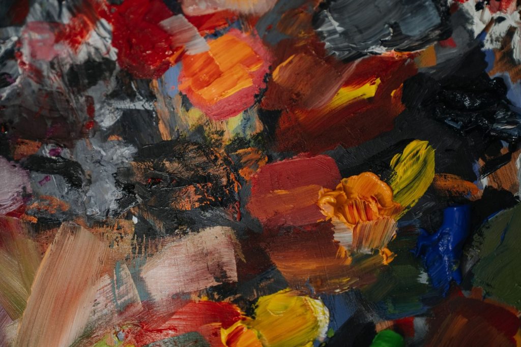
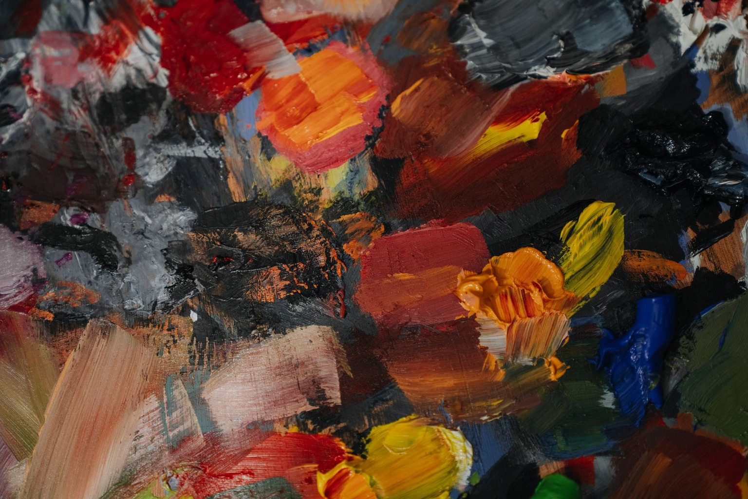
Abstract art strips away recognizable objects, leaving color as the primary vehicle for emotional communication. Neuroscience has mapped how specific wavelengths activate distinct neural pathways, bypassing semantic processing to hit affective centers directly. The brain does not interpret a Rothko canvas as a “sad painting” through logic; it registers chromatic tension and spatial pressure almost instantly. This direct pipeline explains why viewers report visceral reactions to non-representational works they cannot consciously analyze. Understanding this mechanism requires comparing how different color strategies engage the visual cortex, the amygdala, and prefrontal regulatory areas.
Wavelength Processing in the Visual Cortex
The retinal processing of light separates into parallel channels before signals even reach the primary visual cortex. Short-wavelength cones respond to blues and violets, while long-wavelength cones handle reds and oranges. This trichromatic system means that a field of deep blue activates a different neural signature than a saturated red, even if both occupy the same canvas area. Researchers note that high-contrast chromatic combinations generate higher firing rates in V1 and V2 areas compared to monochromatic fields. The speed of this initial processing is critical, as it occurs within milliseconds of visual contact.
Abstract artists exploit this physiological split by placing complementary colors adjacent to one another. When a viewer stares at a boundary between red and green, the opposing cone types create a localized vibration effect known as simultaneous contrast. This perceptual instability forces the brain to work harder to stabilize the image, increasing cognitive load and arousal. The resulting tension is not a conscious judgment but a low-level sensory conflict. Artists like Mark Rothko understood this instinctively, using large color fields to maximize this boundary interaction across the entire viewing space.
The distinction matters when comparing how representational and abstract works are processed. In figurative art, the visual cortex quickly identifies objects, shifting attention to higher-order semantic regions. In abstract color compositions, the identification step fails or is irrelevant, so processing remains locked in the sensory and affective stages. This keeps the viewer trapped in a loop of raw chromatic response without the calming effect of narrative recognition. The brain essentially cannot “finish” looking at the painting because there is no object to label and archive.
Amygdala Activation and Arousal Levels
The amygdala serves as the brain’s rapid threat detector, responding to high-contrast and high-saturation stimuli before conscious awareness kicks in. Neuroimaging studies show that saturated reds and deep oranges trigger stronger amygdala responses than muted pastels or grays. This is an evolutionary legacy where bright, warm colors signaled fire, blood, or ripe fruit, demanding immediate attention. Abstract works dominated by these hues keep the viewer in a state of heightened physiological arousal. The heart rate and skin conductance measurements from lab studies confirm this sustained alertness.
Cooler palettes, such as those used by Hilma af Klint or Judd, produce a different neural profile. Blues and greens tend to activate the parasympathetic nervous system, lowering arousal and inducing a meditative state. The comparison here is stark: warm abstract fields create agitation, while cool fields promote calm. Viewers often misattribute this internal physiological shift to an emotional interpretation of the art itself. They feel “moved” by the blue canvas, unaware that their own autonomic nervous system is simply responding to the wavelength data.
This distinction between arousal and valence is crucial for understanding viewer experience. Arousal measures the intensity of the response, while valence measures whether it feels positive or negative. Warm colors can trigger high arousal with either positive excitement or negative anxiety, depending on context. The abstract format removes contextual cues, leaving the viewer to navigate this ambiguity alone. This lack of narrative scaffolding is what makes abstract color fields so psychologically demanding and personally variable.
Neuroscience continues to refine our understanding of how these low-level visual signals translate into complex emotional states. The data suggests that emotion in art is not a high-level cognitive judgment but a bottom-up physiological event. Artists who master this interaction do not just arrange shapes; they choreograph neural activity. The viewer’s brain becomes the canvas upon which the artist’s color choices are projected. This intimate, involuntary connection is why abstract art remains so potent and so difficult to dismiss as mere decoration.
Prefrontal Regulation and Cognitive Effort
The prefrontal cortex handles executive function, including the suppression of instinctive reactions and the construction of meaning. When viewers engage with abstract color fields, their prefrontal activity often spikes as they attempt to impose narrative structure on non-representational forms. This cognitive effort is measurable in EEG studies showing increased beta-wave activity during prolonged viewing. The brain refuses to let ambiguous stimuli go unprocessed, so it loops through possible interpretations. This struggle is exhausting but also deeply engaging, creating a sense of intellectual participation.
On the Life is art channel, they explain how colors evoke deep feelings, and you can watch it right here.
In contrast, figurative art allows the prefrontal cortex to relax once the subject is identified. A landscape or portrait can be “solved” by the brain, leading to a drop in cognitive load and a shift toward aesthetic appreciation. Abstract color compositions deny this resolution, forcing sustained engagement. The viewer must actively construct their own emotional narrative to make sense of the sensory input. This active participation differentiates abstract art from passive viewing experiences.
The comparison reveals a key difference in how artistic value is perceived. Critics often argue that abstract art lacks “skill” because it does not depict reality accurately. However, the neurological data suggests the skill lies in managing this cognitive tension. A successful abstract composition balances sensory impact with enough structure to prevent total disorientation. The artist guides the prefrontal cortex through a maze of color without letting the viewer get lost. This subtle control is what separates a masterful work from a random arrangement of pigments.
Dopamine Reward Pathways and Aesthetic Pleasure
Aesthetic pleasure activates the dopaminergic reward system, specifically the ventral striatum, in ways similar to food or music. Studies using functional MRI have shown that subjects report higher levels of enjoyment when viewing art they perceive as beautiful, correlating with increased dopamine release. Abstract color compositions can trigger this reward pathway purely through chromatic harmony and balance. The pleasure is not tied to narrative content but to the perceptual satisfaction of resolved visual tension. This makes abstract art a pure sensory experience.
The comparison between harmonic and dissonant color schemes highlights the role of expectation. When adjacent colors vibrate or clash, the brain experiences a minor violation of perceptual smoothness, which can be mildly unpleasant. However, when these tensions are resolved by spatial arrangement or tonal balance, the brain receives a reward signal. This dynamic creates a push-and-pull effect that keeps the viewer engaged. Artists like Kandinsky and Albers experimented extensively with this principle, designing works that oscillate between tension and release.
This reward mechanism explains why viewers return to abstract works repeatedly. Each viewing offers a new combination of sensory inputs as the light changes or the viewer’s mood shifts. The dopamine system responds to novelty and resolution in a cycle that feels intrinsically satisfying. Unlike narrative art, which has a fixed meaning, abstract color fields remain open to reinterpretation. This openness sustains the reward potential over time, making these works particularly effective for long-term engagement.
Individual Differences in Chromatic Sensitivity
Not all brains process color stimuli identically, and individual differences significantly shape the emotional response to abstract art. Factors such as age, gender, cultural background, and personal history with color influence neural sensitivity. Some viewers have a stronger amygdala response to reds, while others react more strongly to blues. These variations are measurable in psychophysiological studies and explain why two people can stand before the same Rothko canvas and report opposite emotional states.
The comparison between high-sensitivity and low-sensitivity viewers reveals the importance of personal calibration. High-sensitivity individuals experience stronger autonomic responses to chromatic stimuli, making abstract art feel overwhelming or deeply moving. Low-sensitivity viewers may find the same works underwhelming because their neural thresholds for arousal are higher. This individual variance challenges the idea of a universal “correct” interpretation of abstract color. The emotional impact is co-created by the artwork and the viewer’s unique neurological profile.
Understanding these differences helps curators and artists tailor exhibitions to diverse audiences. Lighting conditions, viewing distance, and surrounding context can modulate the intensity of the neural response. A work that feels too aggressive in a bright gallery might feel balanced in a dimly lit room. The artist’s intent must account for this variability, designing compositions that offer multiple entry points for different neurological profiles. This flexibility is a hallmark of successful abstract color painting.
Spatial Scale and Perceptual Immersion
The physical size of an abstract color field dramatically alters its neurological impact by changing the viewer’s spatial relationship to the work. Large-scale paintings that fill the entire field of view trigger a sense of immersion, engaging the vestibular system alongside the visual cortex. This full-body engagement shifts the experience from observation to inhabitation. The brain processes the canvas as an environment rather than an object, increasing the depth of emotional involvement. Smaller works, by comparison, are processed as discrete objects with limited sensory impact.

The comparison between immersive and framed viewing experiences highlights the role of peripheral vision. Large abstract works engage the peripheral retina, which is more sensitive to motion and low-frequency spatial patterns. This peripheral processing bypasses detailed foveal analysis, creating a holistic emotional impression before conscious scrutiny begins. The viewer feels “inside” the color field, with the boundaries of the canvas fading into the surrounding space. This effect is why monumental abstract works often elicit stronger physiological responses than smaller studies.
Artists like Agnes Martin and Donald Judd exploited spatial scale to create specific neurological effects. Their works are designed to be experienced from a distance, allowing the peripheral vision to dominate the perceptual process. The result is a calm, meditative state rather than an agitated one. This strategic use of scale demonstrates how abstract art can manipulate not just color perception but entire bodily states. The viewer’s body becomes part of the artwork’s neurological circuit, blurring the line between observer and observed.
Cultural Conditioning and Color Symbolism
While the low-level processing of color is universal, the emotional meaning attached to specific hues is heavily shaped by cultural conditioning. Western viewers associate red with danger or passion, while some East Asian cultures link it to luck and prosperity. These learned associations are stored in semantic memory and can override or modulate the raw physiological response. The brain integrates these cultural codes into its emotional evaluation of the artwork, adding a layer of symbolic meaning to the sensory experience.
The comparison between culturally neutral and symbolically charged palettes reveals different levels of cognitive complexity. A palette of grays and whites may trigger minimal symbolic interference, allowing the raw chromatic response to dominate. A palette of reds and golds, however, activates rich cultural narratives that engage the semantic network. This added layer can enhance or complicate the emotional experience, depending on the viewer’s cultural background. Abstract artists must navigate these symbolic associations carefully to avoid unintended meanings.
This cultural dimension adds a necessary nuance to the discussion of color and emotion. It reminds us that neurological responses are never purely biological; they are always filtered through personal and social history. The “universal” appeal of abstract color fields is partly an illusion, built on a shared human visual system but colored by diverse cultural experiences. Understanding this interplay helps viewers appreciate the complexity of their own emotional responses to art. It also encourages artists to consider the global reach of their work in an increasingly connected world.

I have spent the past decade exploring the intersections of Freemasonry, art, and science, researching historic manuscripts and architectural symbolism. My work as a freelance writer and independent researcher allows me to share the rich history of knowledge that these traditions embody.